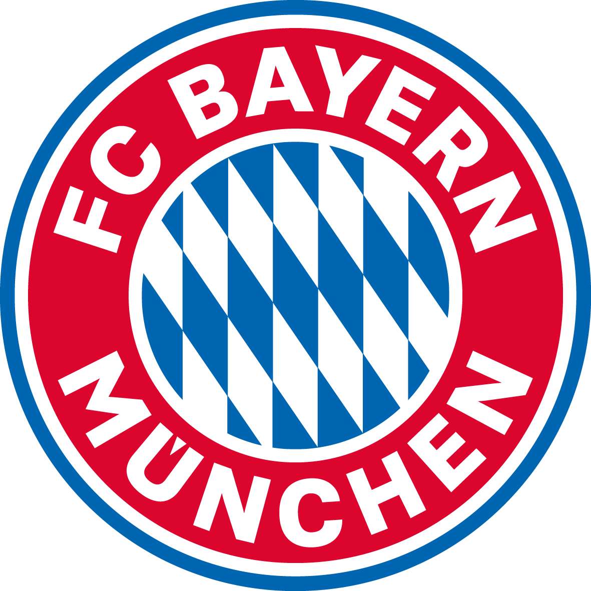
You may not have noticed, but Bayern Munich appear to have updated their logo.
Liverpool to face Bayern at Audi Cup
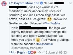
An eagle-eyed Facebook user noticed the the lettering on the club's crest had changed in recent post sent out from the German champions' official account.
 Facebook
Next Match
Bayern responded to the user, confirming that the logo had indeed been modified with a slightly different font and that the colours had been updated.
 Facebook
A graphic designer who is affiliated with the club, Daniel Nyari, commented on Twitter that the red is now warmer, the the blue is darker and that the angle Bavarian lozenges has changed
Nyari also added that the changes were made due to global non-football competition, to consolidate brand tone and add more brand visibility.


