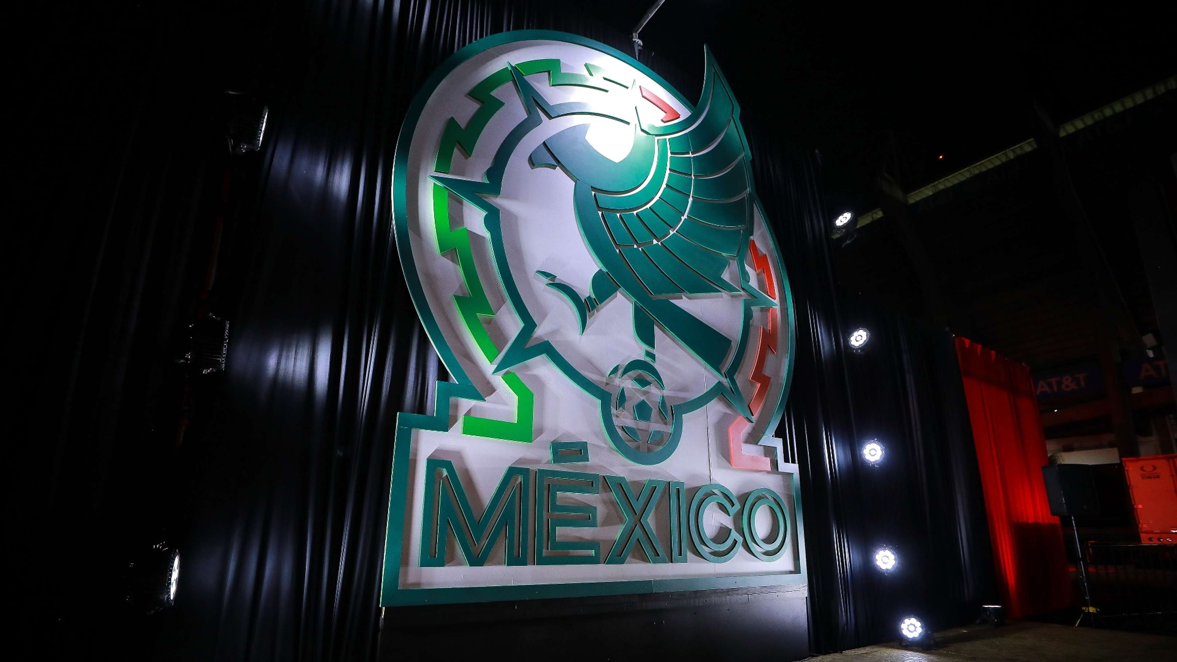
The Mexico national team revealed a new crest on Tuesday night in its first visual change in 33 years.
El Tri's logo now features the name of the country in big letters while boasting a more abstract outline of their iconic eagle.
Mexico will carry the rebrand into the 2022 World Cup - assuming they qualify as they are currently positioned to do - as a way of modernizing its image.
Why did the Mexico national team change its crest?
"It came time to recognize the best parts of our past but modernize ourselves as well," Mexican football federation president Yon De Luisa said to The Athletic. "We couldn't allow ourselves to get to 2026 (when Mexico will be one of the World Cup hosts) with a mark that wasn't contemporary.
"It was an opportunity that we had to capitalize on. We were fortunate to have been advised by several design shops and in the end, we received massive support from our sponsor and commercial partner, Adidas.
"Their design expertise allowed us to create this new image. We tested it (via focus groups) throughout Mexico and the results were very positive."
What does the new El Tri logo look like?
Below are the old and new ones side by side:
Mexico's 2022 World Cup qualifying position
With 14 points from eight matches, El Tri are in solid shape to reach Qatar.
They are currently in third place in CONCACAF, with the top three teams automatically qualifying for the World Cup and the fourth-placed team joining a play-off.
Nation | Matches played | GD | Points |
Canada | 8 | 8 | 16 |
United States | 8 | 7 | 15 |
Mexico | 8 | 4 | 14 |
Panama | 8 | 2 | 14 |
Costa Rica | 8 | -1 | 9 |
Jamaica | 8 | -4 | 7 |
El Salvador | 8 | -6 | 6 |
Honduras | 8 | -10 | 3 |
